ArcMap, a cornerstone of geographic information systems (GIS), opens up a world of spatial data manipulation and analysis. From mapping historical migration patterns to visualizing real-time traffic flow, ArcMap empowers users to explore and understand our world in entirely new ways. This guide dives into the core functionalities, data management techniques, spatial analysis capabilities, and cartographic design principles that make ArcMap such a powerful tool.
Table of Contents
We’ll cover everything from the basics of creating a map and adding data layers to advanced techniques like geoprocessing and creating interactive visualizations. Whether you’re a seasoned GIS professional or just starting out, this comprehensive overview will equip you with the knowledge and skills to effectively utilize ArcMap’s extensive features. Get ready to unlock the potential of your spatial data!
ArcMap’s Core Functionality

ArcMap, while now superseded by ArcGIS Pro, remains a powerful and familiar tool for many GIS professionals. Understanding its core functionality is still valuable, especially when working with legacy data or collaborating with others still using the software. This section will cover the essential elements of ArcMap’s interface and workflow.
ArcMap’s interface is built around a central map window, surrounded by various toolbars and panels that provide access to its diverse capabilities. The main window displays your map, allowing you to visualize and interact with geographic data. Toolbars offer quick access to common tasks like zooming, panning, and editing features. Panels, such as the Table of Contents and the Layers panel, provide information about the data layers displayed on your map and allow you to manage their properties.
Creating a New Map Document
Creating a new map document in ArcMap is straightforward. First, launch the ArcMap application. You’ll be presented with a blank map window. From there, you can start adding data layers and customizing your map’s appearance. Essentially, a blank canvas awaits your spatial creations.
Any map customizations you make are saved within the .mxd file you create.
Adding Data Layers to a Map
Adding data layers is crucial to populating your map with geographic information. This is typically done through the “Add Data” button, usually located on a toolbar. The “Add Data” dialog box allows you to browse your computer’s file system and select various data formats, including shapefiles (.shp), geodatabases (.gdb), and coverages. Once you select a data layer, it’s added to the Table of Contents, and its features are displayed on the map.
For example, you might add a shapefile of roads to show the transportation network, or a raster dataset representing elevation data.
Symbolizing Features in ArcMap
Symbolizing features is vital for clear and effective map communication. Each data layer in ArcMap can be individually symbolized. This process involves choosing visual representations for the features within that layer. You can access symbology settings through the Table of Contents. Right-clicking a layer and selecting “Properties” opens a dialog box where you can adjust various symbology options.
For example, you could symbolize points as different colored circles to represent different types of businesses, or use a graduated color ramp to show population density in polygons. The options are extensive and allow for creative and informative visualization. You can adjust colors, sizes, patterns, and more to create a map that effectively conveys your spatial data.
Experimentation is key to finding the best visual representation for your data.
Data Management in ArcMap
Okay, so we’ve covered the basics of ArcMap. Now let’s dive into the nitty-gritty of actuallyusing* the thing – namely, managing your data. This is where the real power of GIS comes in, and honestly, it’s where you’ll spend most of your time. Getting your data in the right format and cleaned up is key to getting meaningful results.Data management in ArcMap is all about getting your data into the system, cleaning it up, and organizing it so you can actually do something with it.
We’re talking importing different file types, editing features, and generally making sure your data is accurate and ready for analysis. Think of it as prepping ingredients before you start cooking – you wouldn’t just throw raw chicken and flour into a pan, would you?
Importing Data into ArcMap
ArcMap supports a wide variety of data formats. You can bring in shapefiles (.shp), geodatabases (.gdb), coverages, CAD files (.dwg, .dxf), raster data (.tif, .img), and even data from databases like Oracle or SQL Server. The specific method for importing depends on the data type, but generally, it involves using the “Add Data” button on the main toolbar or using the ArcCatalog interface to browse and add datasets to your map document.
For shapefiles, for example, you simply navigate to the folder containing the .shp file and add it to your map. Importing a geodatabase is equally straightforward; you simply browse to the geodatabase file and select the feature classes you want to add. For raster data, you would use the “Add Raster Data” tool, specifying the path to your raster file.
The process is pretty intuitive once you get the hang of it.
Editing and Managing Geospatial Data
Once your data is in ArcMap, you can start editing it. This could involve anything from simple corrections (like fixing a misspelled street name) to more complex edits (like merging polygons or splitting lines). ArcMap provides a robust set of editing tools, including tools for creating new features, modifying existing features, and deleting features. The editor toolbar offers a variety of tools for manipulating features, allowing you to add, move, reshape, and delete vertices, and perform various other editing tasks.
The use of snapping tools helps ensure that features are accurately aligned and connected. For example, you might use the “snapping” option to ensure that lines connect perfectly at intersections, avoiding gaps or overlaps. Regular saving of edits is crucial to prevent data loss.
Data Cleaning and Preparation Workflow
A typical data cleaning workflow involves several steps. First, you’d check for inconsistencies, such as duplicate features or attribute errors. Then, you might use tools to identify and correct these errors. For example, the “Feature Verifier” tool can help identify topological errors such as overlaps or gaps in polygon features. Tools like the “Spatial Join” and “Intersect” can help with data integration and cleaning by matching attributes from different datasets or identifying areas of overlap.
Next, you might need to project your data into a consistent coordinate system, ensuring that all your datasets align correctly. Finally, you would likely perform a thorough visual inspection to identify and correct any remaining errors. This entire process ensures the accuracy and reliability of the data for analysis.
Comparison of Data Structures in ArcMap
ArcMap primarily uses two main data structures: vector and raster. Vector data represents geographic features as points, lines, and polygons, each with associated attributes. This is great for representing discrete features like roads, buildings, or parcels. Raster data, on the other hand, represents data as a grid of cells, each with a value. This is ideal for representing continuous data like elevation or satellite imagery.
The choice between vector and raster depends on the type of data and the intended analysis. For example, analyzing land cover would likely use raster data, while analyzing road networks would use vector data. Understanding these differences is crucial for choosing the right tools and techniques for your analysis.
Spatial Analysis with ArcMap
Okay, so we’ve covered the basics of ArcMap – now let’s dive into the really cool stuff: spatial analysis. This is where we go beyond just looking at maps and start asking questions about therelationships* between different geographic features. Think about things like proximity, overlap, and patterns. Spatial analysis lets us answer those questions and uncover hidden insights in our data.
ArcMap offers a powerful suite of tools for this, and we’ll explore some key functionalities here. We’ll look at a few common tools, walk through buffer and overlay analyses step-by-step, and briefly touch on the world of spatial statistics.
Five Common Spatial Analysis Tools
ArcMap provides a wide array of spatial analysis tools, but here are five that are frequently used and super helpful for a variety of applications. Understanding these tools is key to unlocking the power of spatial analysis in your projects.
- Buffer: Creates zones around features at a specified distance. Think of it like drawing a circle around a point or a line around a polygon. Useful for identifying areas within a certain radius of a point of interest, like finding all houses within a mile of a school.
- Overlay: Combines multiple layers to create a new layer that integrates the spatial information from each input layer. This is super versatile, allowing for things like identifying areas where two different land use types overlap.
- Proximity: Measures distances between features. This can help determine which features are closest to each other, or identify features within a specific distance of a target feature. Imagine using this to find the nearest hospital to an accident site.
- Spatial Join: Links attributes from one layer to another based on spatial relationships. For example, you could join census data to a map of city blocks to get population information for each block.
- Clip: Extracts a portion of one feature class using another as a cookie cutter. This is useful for focusing your analysis on a specific area of interest, like clipping a statewide road network to just a single county.
Performing a Buffer Analysis
Let’s create a buffer around a set of points. Imagine these points represent locations of fire hydrants. We want to know which areas are within 500 feet of a hydrant. This information is crucial for fire safety planning and resource allocation.
- Add your point data: In ArcMap, add the layer containing the fire hydrant locations.
- Access the Buffer tool: Navigate to the “Spatial Analyst Tools” toolbox and find the “Buffer” tool.
- Set parameters: Specify the input feature class (your fire hydrant points), the buffer distance (500 feet), and the output feature class name (e.g., “HydrantBuffers”).
- Run the tool: Click “OK” to execute the tool. A new layer will be created showing the buffer zones around each hydrant.
- Analyze the results: The resulting layer visually represents the areas covered by the fire hydrants. You can use this to assess coverage and identify potential gaps in fire protection.
Overlay Analysis: A Step-by-Step Guide
Overlay analysis is a powerhouse tool. We’ll explore two common types: intersect and union. Imagine we have two layers: one showing land ownership parcels and another showing areas zoned for residential development. We want to find the parcels that are also zoned for residential use.
Intersect Overlay:
- Input Layers: Add your land ownership parcels and residential zoning layers to ArcMap.
- Intersect Tool: Find the “Intersect” tool within the “Overlay” tools.
- Parameters: Select your input layers and specify the output layer name (e.g., “ResidentialParcels”).
- Execution: Run the tool. The output will be a new layer showing only the areas where the parcels and residential zoning overlap.
Union Overlay:
Now, let’s say we want to see all areas, regardless of overlap, combining both layers’ attributes.
- Input Layers: Same as above.
- Union Tool: Find the “Union” tool within the “Overlay” tools.
- Parameters: Select your input layers and specify the output layer name (e.g., “CombinedZoning”).
- Execution: Run the tool. The output will be a new layer showing all areas from both input layers, with attributes from both.
Spatial Statistics in ArcMap
Spatial statistics go beyond simple measurements and allow us to analyze the patterns and relationships within spatial data. This helps us identify clusters, hotspots, outliers, and other significant spatial patterns that might not be obvious from a simple visual inspection.
For example, imagine analyzing crime incidents across a city. Spatial statistics could help identify clusters of high crime activity, allowing law enforcement to focus resources effectively. Tools like Hot Spot Analysis (Getis-Ord Gi*) can reveal statistically significant clusters of high or low values. Another example could be analyzing the spatial distribution of disease cases to identify potential sources of outbreaks.
Okay, so ArcMap’s kinda like the OG for GIS stuff, right? But if you need to model the 3D aspects of your geographic data, you might want to check out the CAD side of things. For that, solidworks 2022 is a pretty solid choice. Then, you can import those models back into ArcMap for analysis and visualization – it’s all about workflow!
Spatial autocorrelation analysis (like Moran’s I) can assess whether nearby locations exhibit similar values, revealing spatial patterns in the data.
Cartography and Map Design in ArcMap
Creating effective maps in ArcMap is crucial for communicating geographic information clearly and concisely. This involves understanding map layout principles, selecting appropriate symbology, and carefully considering map scale and projection. A well-designed map transforms raw data into a powerful visual narrative, readily understood by its intended audience.
Effective Map Layouts in ArcMap
Designing an effective map layout requires careful consideration of several key elements. The arrangement of map elements—title, legend, scale bar, north arrow, and the map itself—should be balanced and visually appealing, ensuring easy readability and interpretation. White space should be used strategically to avoid a cluttered appearance. ArcMap offers a variety of tools to help you create and customize layouts, including the ability to add text boxes, graphics, and other elements.
Consistent font styles and sizes enhance readability. For example, a map depicting population density might benefit from a larger font size for labels in densely populated areas to prevent overlap and ensure readability.
Thematic Map Design in ArcMap
Thematic maps highlight a particular geographic theme or attribute. Effective thematic map design involves choosing appropriate symbology to represent data visually. For example, choropleth maps use color shading to represent data values across different geographic areas; proportional symbol maps use the size of symbols to represent data values; and isarithmic maps use lines to connect points of equal value (isolines).
Clear and concise labeling is also essential; labels should be easily readable and avoid overlapping with map features or other labels. Consider using a colorblind-friendly palette to ensure accessibility for all users. A map showing average rainfall across a state, for example, might use a graduated color scheme, with darker shades representing higher rainfall amounts, and clear labels for each region.
Map Scale and Projection in ArcMap
Map scale represents the ratio between the distance on the map and the corresponding distance on the ground. Choosing the appropriate scale is crucial for representing the data accurately and effectively. A large-scale map shows a smaller area in greater detail, while a small-scale map shows a larger area with less detail. Projection involves transforming the three-dimensional Earth’s surface onto a two-dimensional map, which inevitably introduces distortion.
Understanding the different types of map projections and their inherent distortions is vital for selecting the most suitable projection for a given application. A map of a small city might use a large scale, while a map of the entire United States might require a smaller scale.
Map Projections and Their Suitability
Different map projections are suited to different applications depending on the area being mapped and the type of analysis being conducted. Choosing the wrong projection can lead to significant distortions, particularly in area, shape, and distance.
| Projection Name | Strengths | Weaknesses | Suitable Applications |
|---|---|---|---|
| Mercator | Preserves shape and direction; useful for navigation. | Severely distorts area, especially at higher latitudes. | Navigation, world maps (despite distortions). |
| Albers Equal-Area Conic | Preserves area; minimizes distortion within a limited region. | Distorts shape and direction, particularly near the edges. | Mapping large areas with relatively low latitude extent, such as the contiguous United States. |
| Lambert Conformal Conic | Preserves shape and direction; minimizes distortion within a limited region. | Distorts area, especially near the edges. | Mapping areas with a north-south orientation, such as countries with significant longitudinal extent. |
| Robinson | Compromise projection that attempts to balance distortions in area, shape, and direction. | Distorts all three properties, but to a lesser extent than other projections. | General-purpose world maps where a balance of distortions is desired. |
Geoprocessing in ArcMap
Geoprocessing in ArcMap is all about automating your GIS workflows. Instead of manually performing a series of tasks, you can build models that chain together different tools and processes, saving you time and ensuring consistency. Think of it as creating a recipe for your spatial data analysis, allowing you to reproduce results easily and efficiently. This section will explore the creation and use of geoprocessing models and the role of scripting in automating tasks within ArcMap.
Geoprocessing Models in ArcMap
A geoprocessing model in ArcMap is essentially a visual representation of a workflow. It’s like a flowchart, but instead of general steps, it uses specific geoprocessing tools as building blocks. These tools perform operations on your spatial data, such as clipping, buffering, overlaying, or calculating statistics. By connecting these tools in a model, you create a repeatable process that can be executed with different input data.
The model visually documents the workflow, making it easier to understand and maintain, especially for complex analyses. The outputs from one tool automatically become the inputs for the next, creating a seamless, automated process. For example, a model might first clip a raster dataset to a polygon, then calculate statistics on the clipped raster, and finally export the results to a table.
Creating a Simple Geoprocessing Model
Creating a simple model involves selecting the tools you need from the ArcToolbox, arranging them in the desired order, and connecting their inputs and outputs. Let’s say we want to create a buffer around points and then clip a polygon by that buffer. First, you’d add the “Buffer” tool and the “Clip” tool to the model. Then, you’d connect the output of the “Buffer” tool (the buffered points) to the “Input Features” parameter of the “Clip” tool.
Finally, you’d specify the input point data and the polygon data as parameters for the respective tools. Once the model is built, you can run it by providing the necessary input data. ArcMap will execute the tools sequentially, producing the final clipped polygon. The entire process is documented within the model itself, making it easy to share and reuse.
Scripting in ArcMap for Automation
While models offer a visual approach to automation, scripting provides a more powerful and flexible way to control geoprocessing workflows. ArcMap supports Python scripting, allowing you to write custom code to automate complex tasks that might be difficult or impossible to achieve solely with models. You can use Python to control tool parameters dynamically, handle errors, loop through datasets, and integrate with other applications.
For example, you could write a script to process a large number of shapefiles, applying a consistent set of geoprocessing tools to each one. The script could handle any errors encountered during processing and generate a log file to track its progress. This level of control allows for highly customized and efficient automation.
Common Geoprocessing Tools and Their Applications
Many geoprocessing tools are available in ArcToolbox, categorized by functionality. Some common examples include:
- Buffer: Creates a zone around features at a specified distance. This is useful for analyzing proximity, such as finding areas within a certain distance of a road or a hazardous waste site.
- Clip: Extracts a portion of a dataset based on a boundary feature. For instance, you could clip a raster image to the boundaries of a county to focus analysis on that specific area.
- Intersect: Overlays two or more datasets to find the areas where they overlap. This is useful for finding areas where multiple criteria are met, such as finding areas suitable for development that are also within a certain distance of utilities.
- Union: Combines two or more datasets, retaining all features from the input datasets. Useful for merging different data layers with overlapping areas, such as merging different land-use classifications.
- Spatial Join: Appends attributes from one dataset to another based on spatial relationships. For example, you could add population data from census tracts to points representing schools to analyze school populations.
These are just a few examples; ArcToolbox contains a vast library of tools catering to diverse GIS tasks. The selection and application of these tools within models or scripts allow for the creation of highly customized and efficient geoprocessing workflows.
Extending ArcMap Functionality
ArcMap, while powerful on its own, can be supercharged with extensions. These add-ons provide specialized tools and functionalities that aren’t included in the base software, allowing you to tailor ArcMap to your specific GIS needs and workflows. Think of them as app store downloads for your mapping software, but way more powerful.Extensions significantly expand ArcMap’s capabilities, allowing users to tackle complex tasks and analyze data in ways that wouldn’t be possible otherwise.
By leveraging these extensions, you can streamline your workflow, improve efficiency, and unlock advanced analytical potential. The choice of extension depends heavily on the specific needs of your project and the type of data you’re working with.
Popular ArcMap Extensions and Their Functionalities
Three popular extensions significantly enhance ArcMap’s capabilities. These are just a few examples, and many others exist depending on your specific needs.
- Spatial Analyst: This extension is a must-have for anyone working with raster data. It provides a comprehensive suite of tools for performing spatial analysis on raster datasets, including things like surface analysis, hydrological modeling, and image classification. For example, you could use Spatial Analyst to model the potential spread of a wildfire based on terrain characteristics and fuel types, or to analyze changes in land cover over time using satellite imagery.
- 3D Analyst: As the name suggests, this extension allows you to work with and analyze 3D data. It provides tools for creating, visualizing, and analyzing 3D surfaces and models. Imagine you’re working on a project involving terrain modeling for a new road construction project. 3D Analyst would be crucial for visualizing the terrain, analyzing slopes, and determining optimal road alignments.
- Network Analyst: This extension is ideal for anyone working with network datasets, such as road networks or utility networks. It provides tools for solving network-related problems, such as finding the shortest route, determining optimal service areas, or analyzing network flow. For instance, a logistics company could use Network Analyst to optimize delivery routes, minimizing travel time and fuel consumption.
Another example would be emergency services determining the quickest route to an incident based on real-time traffic conditions.
Installing and Configuring an ArcMap Extension
Installing an ArcMap extension is generally straightforward. You typically obtain the extension from Esri or a third-party vendor, usually in the form of an installation file (.exe or .msi). The process usually involves running the installer, accepting the license agreement, and selecting the installation directory. After installation, the extension needs to be enabled within ArcMap. This is usually done through the ArcMap Customize menu, where you can add the extension’s toolbars and commands to the ArcMap interface.
Configuration options vary depending on the specific extension, but often involve setting parameters and defining data sources.
Comparing the Functionalities of Two ArcMap Extensions
Let’s compare Spatial Analyst and Network Analyst. While seemingly disparate, both can contribute to a single project. Spatial Analyst excels in raster-based analysis, for example, creating a cost surface showing travel difficulty across a terrain. This cost surface, then, becomes the input for Network Analyst, which can use this surface to find the optimal route across that terrain, considering the cost of traversal.
So, while Spatial Analyst prepares the data, Network Analyst uses that data for network analysis. They complement each other to achieve a more complex analysis that neither could do alone.
ArcMap and Data Visualization
ArcMap, while maybe feeling a bit old-school compared to the shiny new GIS platforms, still packs a serious punch when it comes to visualizing spatial data. Understanding how to effectively leverage its visualization tools is key to communicating geographic information clearly and compellingly. This section explores different visualization strategies within ArcMap, focusing on techniques for both attribute and spatial data representation.Effective visualization in ArcMap hinges on choosing the right tools for your data and your message.
The goal isn’t just to
- show* the data, but to
- tell a story* with it, highlighting key trends, patterns, and relationships. This involves careful consideration of color schemes, symbology, labeling, and the overall map design.
Visualizing Spatial Data in ArcMap
A robust visualization strategy for spatial data in ArcMap begins with understanding the type of data you’re working with – points, lines, or polygons – and the message you want to convey. For point data, consider using graduated symbols to represent varying attribute values, or different symbols to distinguish categories. Line data might be best visualized using graduated lines to show magnitude or different colors to represent categories.
Polygon data often benefits from graduated colors or unique values to highlight variations across areas. Always consider the map’s scale and the level of detail needed for clarity. Overly complex visualizations can obscure the intended message.
Visualizing Attribute Data in ArcMap
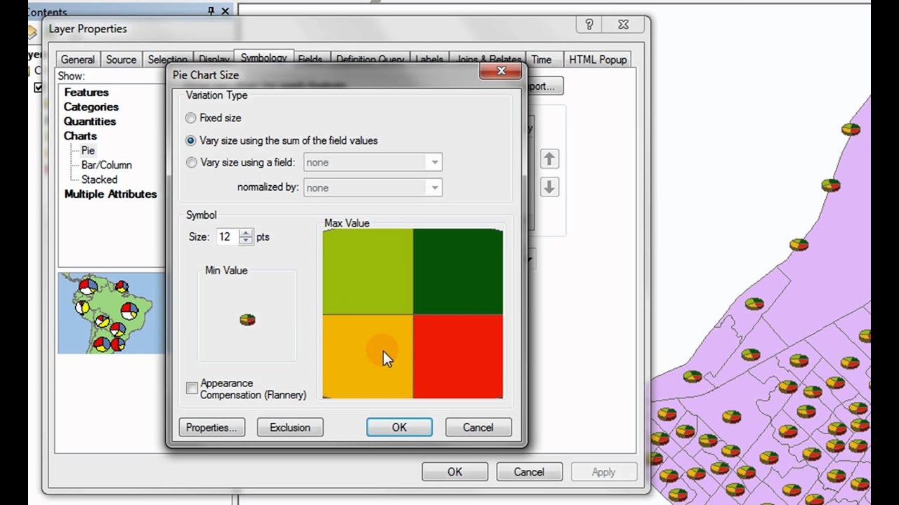
ArcMap offers several ways to visualize attribute data alongside spatial features. One common method is using graduated symbols or colors, where the size or color of a feature reflects its attribute value. For example, you could represent population density using graduated circles, with larger circles indicating higher density. Another approach is to use charts and graphs within the map, such as pie charts to show proportions within each feature or bar graphs to compare values across features.
These methods help viewers quickly grasp relationships between spatial locations and associated attributes.
Creating Interactive Maps in ArcMap
While ArcMap’s interactive capabilities aren’t as sophisticated as some newer platforms, it still offers ways to enhance user engagement. One approach is to use hyperlinks to connect map features to external web pages or documents containing additional information. Another is to create map layers that can be toggled on and off, allowing users to selectively view different aspects of the data.
Moreover, well-placed labels and a clear legend greatly improve map interactivity by providing context and information to the user. Careful planning of map elements will ensure ease of navigation and understanding.
Examples of Effective Data Visualizations in ArcMap
Effective data visualization in ArcMap is about clarity and impactful communication. Here are some examples:
- Choropleth map showing population density: A map of a state where counties are shaded based on population density per square mile, using a graduated color scheme to clearly show high and low density areas. The legend provides a clear scale for interpretation.
- Graduated symbol map illustrating crime rates: A map of a city where the size of a point represents the number of crimes reported in a specific area, with larger points indicating higher crime rates. Different colors can be used to differentiate types of crime.
- Isoline map depicting elevation: A contour map showing elevation levels with lines connecting points of equal elevation, creating a visual representation of the terrain. Different line thicknesses can indicate steeper slopes.
Troubleshooting Common ArcMap Issues
ArcMap, while a powerful GIS tool, can sometimes throw curveballs. Understanding common errors and troubleshooting techniques is crucial for efficient workflow and preventing hair-pulling moments. This section covers several frequent issues, offering practical solutions to get you back on track.
Data Loading Errors
Data loading problems are among the most common ArcMap headaches. These can stem from various sources, including incorrect file paths, incompatible data formats, or issues with the data itself. Addressing these requires a systematic approach.
- Incorrect File Paths: Double-check the file path you’ve entered. A simple typo can derail the entire process. Use the “Browse” function to navigate directly to the file instead of manually typing the path.
- Incompatible Data Formats: ArcMap supports a wide range of data formats, but not all. Ensure your data is in a compatible format (shapefiles, geodatabases, etc.). If not, consider converting it using appropriate tools.
- Data Corruption: Sometimes, the data itself might be corrupted. Try opening the data in a text editor (for smaller files) or using data repair tools provided by the data’s source to identify and fix any errors.
- Missing Dependencies: Certain datasets rely on other files or databases. Make sure all necessary components are present and accessible.
Projection and Coordinate System Issues
Mismatched projections are a frequent source of map display errors. Features might appear in the wrong location or be distorted.
- Defining the Coordinate System: Always explicitly define the coordinate system of your data. If it’s unknown, try to determine it from metadata or the data source. Using the wrong projection can lead to significant inaccuracies.
- Projecting Data: Use ArcMap’s projection tools (Project tool in the Data Management toolbox) to transform data to a common coordinate system before combining datasets. This ensures accurate spatial relationships.
- On-the-Fly Projection: While convenient, on-the-fly projection can impact performance. For large datasets or complex analyses, projecting data beforehand is recommended.
Performance Problems
ArcMap’s performance can degrade with large datasets or complex operations. Several strategies can mitigate this.
- Data Subsetting: Work with subsets of your data whenever possible. Analyzing a smaller, representative portion can speed up processing significantly.
- Caching: Utilize ArcMap’s caching features to store frequently accessed data in memory. This reduces the need for repeated disk access.
- Layer Simplification: Simplify complex layers by reducing the number of vertices or using generalized versions. This reduces the rendering load on ArcMap.
- Hardware Upgrades: Consider upgrading your computer’s RAM and processor. ArcMap is resource-intensive, and more powerful hardware can dramatically improve performance.
ArcMap Crashes
Unexpected crashes can be frustrating. While pinpointing the exact cause can be challenging, these steps can help.
- Check for Updates: Ensure you’re using the latest version of ArcMap with all necessary patches. Updates often include bug fixes that address stability issues.
- Restart ArcMap and Your Computer: A simple restart can often resolve temporary glitches.
- Review Recent Actions: Try to identify any specific actions or processes that might have preceded the crash. This can provide clues about the cause.
- Check System Resources: Monitor your computer’s CPU and RAM usage. Excessive resource consumption can lead to crashes.
Geoprocessing Errors
Errors during geoprocessing tasks can arise from various factors.
- Invalid Input Parameters: Double-check all input parameters to ensure they are correct and compatible with the chosen tool. Incorrect data types or values can cause errors.
- Insufficient Disk Space: Geoprocessing tasks often create temporary files. Ensure you have enough free disk space to accommodate these files.
- Tool Limitations: Some geoprocessing tools have limitations on input data size or complexity. If you encounter errors with very large datasets, consider alternative approaches or breaking down the task into smaller parts.
- Environment Settings: Incorrectly configured environment settings (e.g., workspace, scratch workspace) can lead to errors. Verify that these settings are appropriate for the task.
ArcMap in Different Fields
ArcMap, while no longer actively developed, remains a powerful tool with a legacy of applications across numerous fields. Its robust geoprocessing capabilities and spatial analysis functions continue to be valuable for professionals working with geographic data. This section explores some key areas where ArcMap has made, and continues to make, a significant impact.
ArcMap Applications in Environmental Management
ArcMap is extensively used in environmental management for tasks ranging from habitat mapping and conservation planning to pollution monitoring and impact assessment. For example, environmental agencies might use ArcMap to overlay maps of endangered species habitats with proposed development projects to identify potential conflicts and inform mitigation strategies. Analysis of soil types, water quality data, and air pollution levels, all integrated within a GIS environment like ArcMap, allows for comprehensive environmental risk assessments and informed decision-making.
Further, visualizing changes in deforestation rates over time, using remotely sensed data processed within ArcMap, can be crucial for tracking progress towards conservation goals.
ArcMap in Urban Planning
Urban planners rely on ArcMap for a wide array of tasks, including land-use planning, infrastructure management, and urban growth modeling. Analyzing demographic data, zoning regulations, and transportation networks within ArcMap allows planners to identify areas needing improvement and to assess the potential impacts of proposed developments. For instance, overlaying projected population growth with existing infrastructure capacity can highlight potential strains on services like water supply or public transportation.
Similarly, analyzing accessibility to healthcare facilities or green spaces using ArcMap helps to create more equitable and livable urban environments. ArcMap facilitates the creation of detailed maps illustrating proposed developments, including zoning changes and infrastructure improvements, making them easily understandable to stakeholders and the public.
ArcMap’s Role in Transportation Analysis
Transportation planning and analysis heavily leverage ArcMap’s capabilities. Analyzing road networks, traffic flow patterns, and public transportation routes allows planners to identify bottlenecks, optimize routes, and improve overall transportation efficiency. For example, ArcMap can be used to model the impact of new road construction or transit lines on traffic congestion. Furthermore, the analysis of accident data overlaid on road networks helps to pinpoint high-risk areas and inform safety improvements.
By integrating data on travel times, distances, and accessibility, ArcMap helps create comprehensive transportation plans that are data-driven and informed.
ArcMap Use in Public Health Research
Public health professionals utilize ArcMap to analyze disease outbreaks, track the spread of infectious diseases, and assess the impact of health interventions. For example, mapping the distribution of reported cases of a disease overlaid with socioeconomic factors and environmental variables allows researchers to identify risk factors and potential causes. ArcMap also facilitates the identification of populations at higher risk and assists in the design of targeted public health interventions.
This spatial analysis of health data helps to improve resource allocation and develop more effective public health strategies. Furthermore, the visualization of health data in maps created using ArcMap makes complex information easily understandable to both researchers and the general public.
Comparing ArcMap with other GIS Software
ArcMap, while a powerful and widely-used GIS application, isn’t the only game in town. Understanding its strengths and weaknesses relative to other software packages is crucial for choosing the right tool for a given project. This section compares ArcMap with QGIS and ArcGIS Pro, highlighting key differences in data handling, spatial analysis capabilities, and overall functionality.
ArcMap and QGIS: A Feature Comparison
ArcMap and QGIS represent distinct approaches to GIS software. ArcMap, a component of the ArcGIS Desktop suite, is a proprietary, commercially licensed application known for its robust functionality and extensive toolset. QGIS, on the other hand, is an open-source, free and cross-platform application gaining significant popularity due to its accessibility and active community support. While both handle many standard GIS tasks, their strengths lie in different areas.
ArcMap excels in complex, large-scale projects where advanced spatial analysis and data management are paramount. Its extensive extension library allows for customization and integration with other Esri products. QGIS, with its open-source nature, offers flexibility and extensibility through plugins, making it a strong choice for users who prefer customizable solutions and community-driven development. However, QGIS might lack some of the highly specialized tools and polished user interface found in ArcMap.
Data Handling Capabilities: ArcMap vs. Other GIS Software
Different GIS software packages offer varying capabilities in data handling. ArcMap’s strength lies in its seamless integration with the entire ArcGIS ecosystem, allowing for efficient management of geodatabases and other Esri-specific data formats. It excels at handling large datasets and complex data structures. QGIS, while supporting a wide range of data formats, may require more manual intervention or the use of plugins for managing particularly complex or large datasets.
ArcGIS Pro, the successor to ArcMap, also boasts advanced data management features, often surpassing ArcMap in terms of performance and user experience with large datasets. Differences in data handling can significantly impact project workflow and efficiency, especially for projects involving massive datasets or unique data structures. For instance, ArcMap’s geodatabase management tools are considered industry standard for many large-scale projects, offering robust data integrity and versioning capabilities.
Spatial Analysis Functionalities: ArcMap, QGIS, and ArcGIS Pro
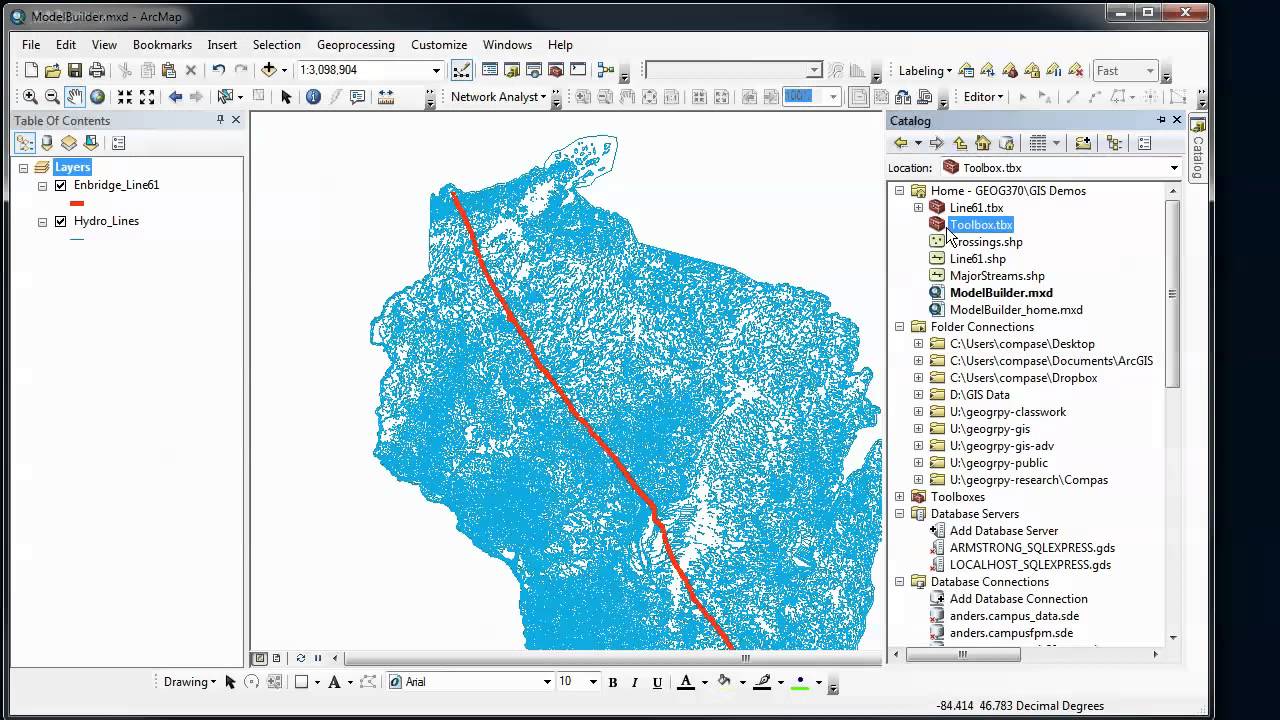
The spatial analysis capabilities of different GIS software packages vary in terms of both the range of tools and their performance. ArcMap offers a comprehensive suite of spatial analysis tools, including advanced geoprocessing capabilities through its ModelBuilder and Python scripting. QGIS provides a growing selection of spatial analysis tools, many of which mirror those in ArcMap, but may differ in implementation or performance.
ArcGIS Pro builds upon ArcMap’s capabilities, often offering improved performance and a more streamlined user experience. For example, while both ArcMap and QGIS offer tools for network analysis, ArcMap might offer more advanced options for complex network models. The choice of software depends on the complexity of the analysis required and the user’s familiarity with the available tools.
A large-scale hydrological modeling project, for example, might benefit from ArcMap’s or ArcGIS Pro’s more advanced tools, while a simpler spatial analysis task could be efficiently completed using QGIS.
Comparative Table: ArcMap, QGIS, and ArcGIS Pro
| Feature | ArcMap | QGIS | ArcGIS Pro |
|---|---|---|---|
| Licensing | Proprietary, Commercial | Open Source, Free | Proprietary, Commercial |
| Platform | Windows | Cross-platform (Windows, macOS, Linux) | Cross-platform (Windows, macOS, Linux) |
| Data Handling | Excellent Geodatabase support | Wide format support, potential limitations with very large datasets | Excellent, improved performance over ArcMap |
| Spatial Analysis | Comprehensive, advanced tools | Growing suite of tools, potentially less advanced than ArcMap | Comprehensive, improved performance and user experience over ArcMap |
| User Interface | Mature, but can feel dated | Modern and intuitive | Modern and intuitive |
| Extensibility | Extensive through extensions | Extensive through plugins | Extensive through extensions and Python scripting |
Last Point
So, there you have it – a journey through the world of ArcMap. We’ve explored its core functionality, delved into data management and spatial analysis, mastered map design principles, and even touched upon troubleshooting and comparisons with other GIS software. While ArcMap might be showing its age compared to ArcGIS Pro, its power and accessibility remain undeniable for many users.
Hopefully, this guide has provided you with the tools and understanding to confidently tackle your own GIS projects using this powerful software. Happy mapping!
Frequently Asked Questions
Is ArcMap still relevant in 2024?
While ArcGIS Pro is the current flagship, ArcMap remains relevant for many users, especially those working with legacy data or preferring its familiar interface. Many organizations still rely on it for specific tasks.
How much does ArcMap cost?
ArcMap is licensed as part of an ArcGIS Desktop license, and pricing varies depending on the license type and the number of users. Check Esri’s website for the most up-to-date pricing information.
What are the system requirements for ArcMap?
System requirements depend on the ArcMap version. Generally, you’ll need a reasonably modern computer with sufficient RAM and disk space. Consult Esri’s documentation for specifics on your version.
Can I use ArcMap with open-source data?
Absolutely! ArcMap supports a wide range of data formats, including many open-source formats like shapefiles and GeoTIFFs.
Where can I find tutorials and support for ArcMap?
Esri’s website offers extensive documentation, tutorials, and a support community. You can also find many helpful resources through online searches and YouTube.